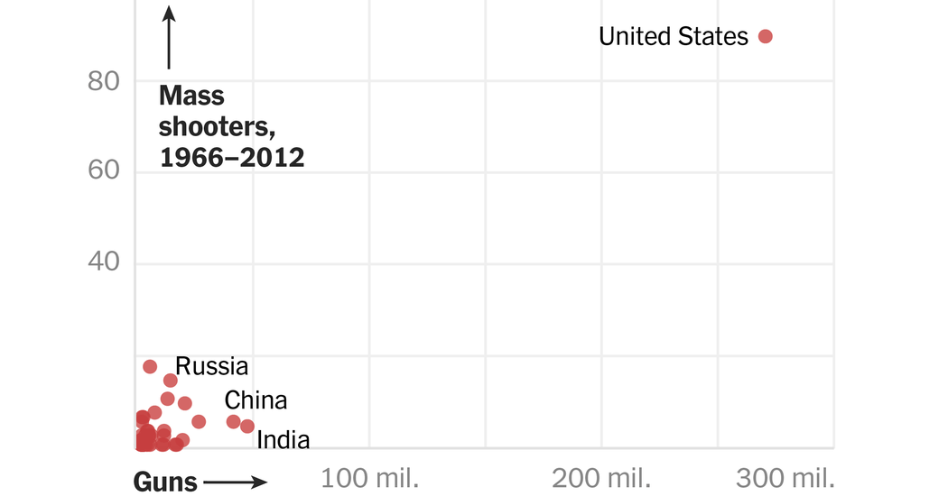
The New York Times published the graph above last November, as part of an article called, “What Explains US. Mass Shootings? International Comparisons Suggest an Answer.” It’s an older article, but I just ran into it.
Give the graph a look. It does seem to suggest… well, something. Sure, correlation doesn’t mean causality. But, um, you know?
Worst part? I ran into this article a few days ago. I started to write a draft post. Before I finished, we had another mass shooting, this time at an old, historic newspaper in Annapolis.